XPath
XPath is a responsive app aimed at people looking to relocating abroad. It allows them to search for and book a session with an expert who can provide professional counsel on a variety of matters, such as housing, healthcare, visa and more.
This project was developed in the context of my CareerFoundry UX certification course.
Overview
- Role: UX/UI Designer
- Tools: Pen & Paper, Figma, Photoshop
- Time: 6 months
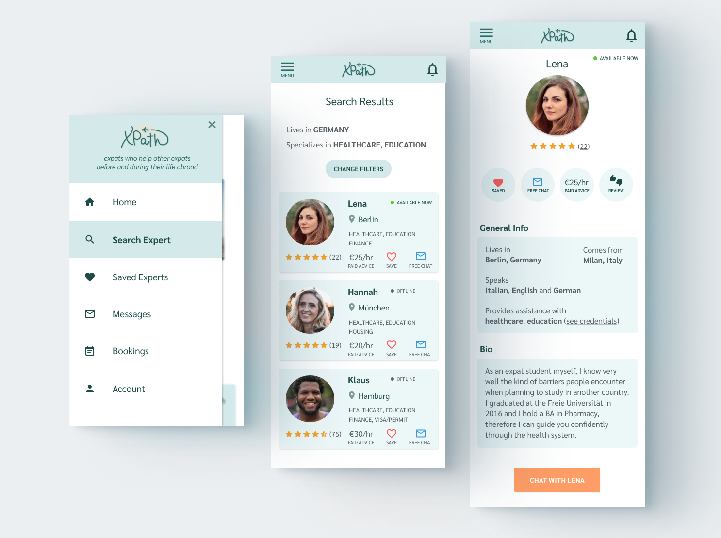
THE CHALLENGE
When looking for information about moving abroad, people often incur in resources which are too generic, making it difficult to find advice on a specific subject. Moreover, the lack of up-to-date sources might lead to outdated advice, as well as confusion as to whether one source is providing reliable, documented information about a certain matter.As a first step I ran a competitive analysis, so I could see what are the problems that our potential competitors are trying to solve and where they can improve in doing so. According to my findings, I put together a problem statement that helped me trace the following steps.
To find out whether these assumptions were true, I created an online survey, an interview script and interviewed five people who are in the process of moving to another country, who already moved or who are thinking of doing so in the future, in order to understand:
- What kind of difficulties they encountered
- Where they gathered information
- On which aspects they would ask for expert advice
- What is the biggest obstacle to obtaining information online
KEY FINDINGS
- Users prefer to receive assistance via instant messaging
- The ability to send files is crucial, as they might be dealing with immigration documents
- Long processes and uncertainty are the main cause of friction
- In order to provide relevant results, the search feature should provide clear filtering options
- Prices and specializations should be immediately visible
- A system of reviews would help users trust an expert
USER PERSONAS
Using all the information I gathered during my interviews and affinity mapping, I created two user personas for visualizing and empathizing with the diverse users who will use my application.
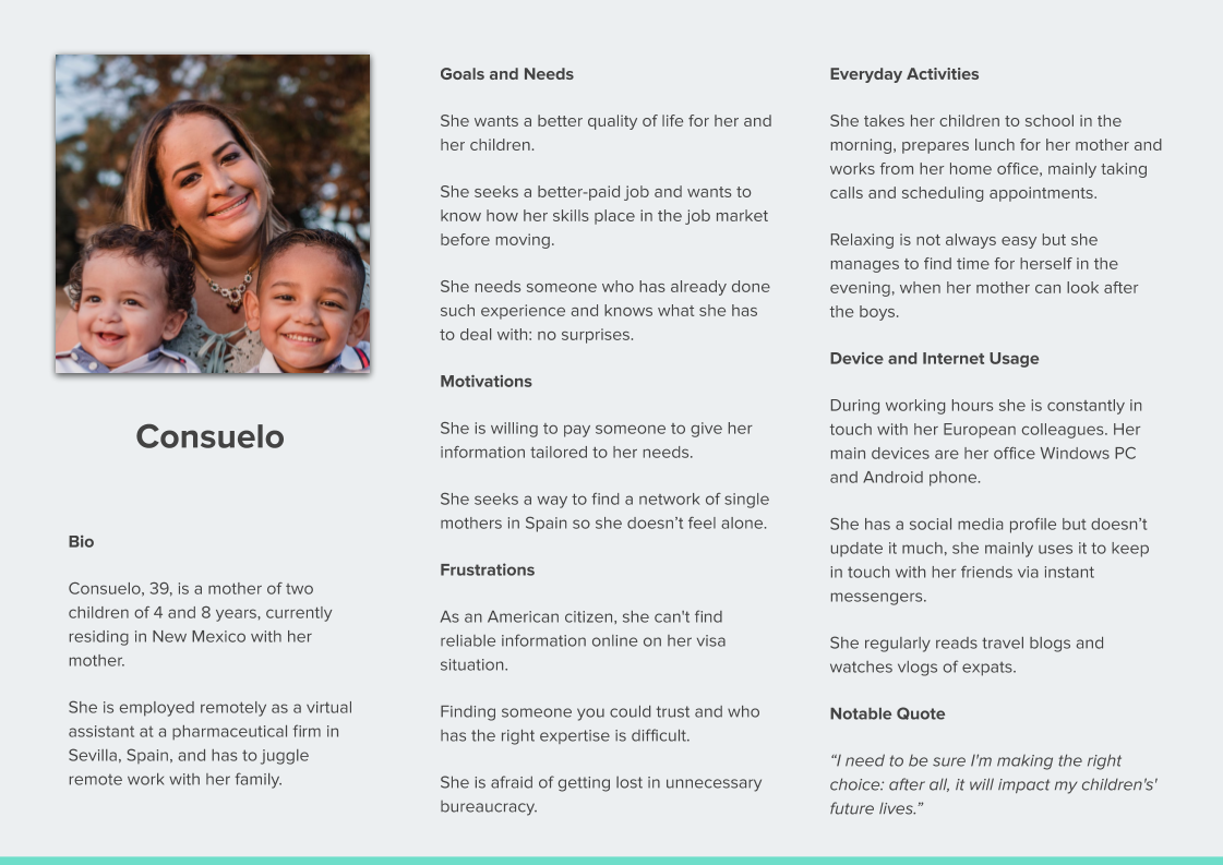
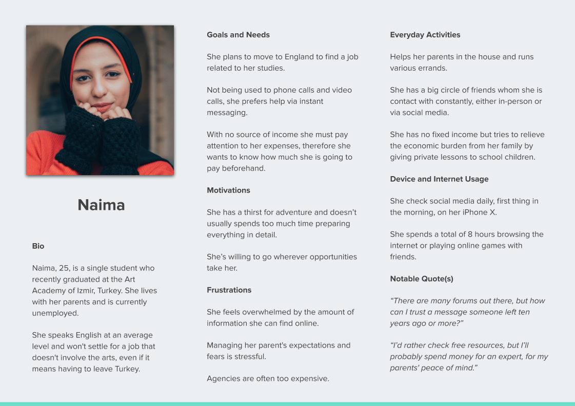
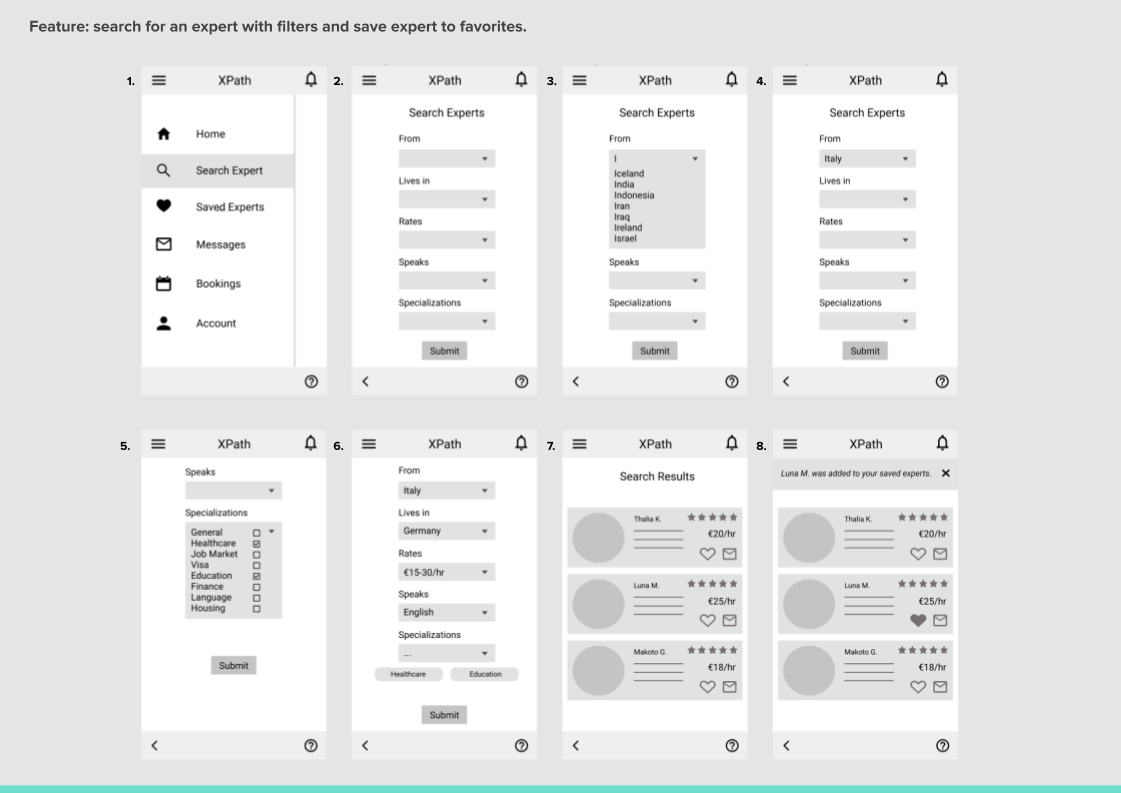
At this point it was clear that the main feature of my application would be the search function. I chose the categories of the filters based on the results of the online survey, selecting the topic where users felt they would need the most help with.
The user scenarios proved to be a valuable asset for considering what the users are thinking and feeling when they go through one of XPath's features and paved the way to task analysis.
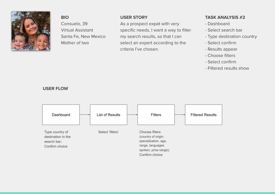
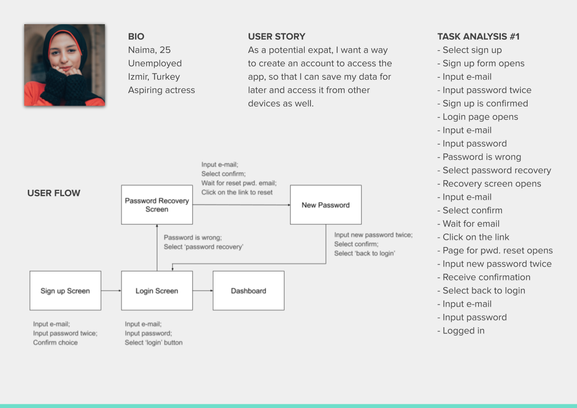
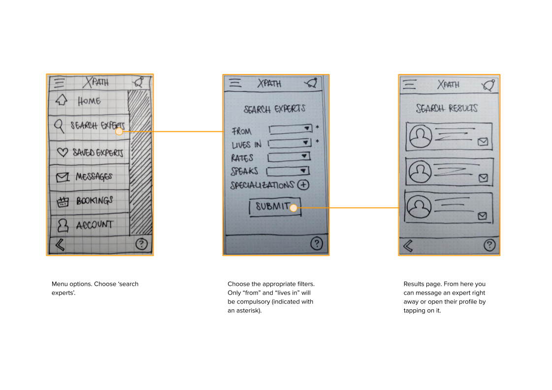
In the next phase I sketched the overall look of my app with pen and paper and transformed my user flows into wire flows, using my low-fidelity wireframes. With a basic structure in hand, I was finally able to build a mid-fidelity interactive prototype for testing purposes on Figma.
USABILITY TESTING
Time to test! My potential users (both former and prospect expats) tested the prototype. They had to perform short tasks on the prototype, while I gathered feedback and tried to identify the pain points and chances of improvement, along with the priority of the iterations. I organized the data in a rainbow spreadsheet, categorized the issues, prioritized the fixes and iterated the existing prototype.
ITERATIONS
Issue #1 (medium severity): participants could not find the review button; they expected to find it respectively under saved experts, booking and messages. Those looking for the review option claimed they were trying to access those section to find the expert's profile.
Possible Solution: add a review button in the booking history and another one inside the expert's profile.
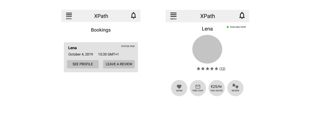
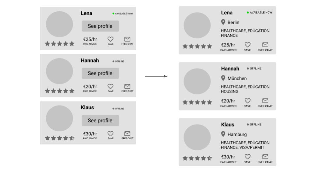
Issue #2 (high severity): users found that profile previews were not self-explanatory enough and the free chat button was too small.
Possible Solution: add expert location ad specializations, enlarge free chat button.
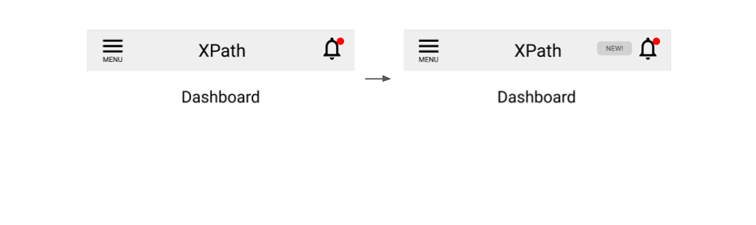
Issue #3 (low severity): notifications do not stand out enough.
Possible Solution: added the "NEW!" To the left of the bell, which stays there until the user has acknowledged the presence of the notifications.
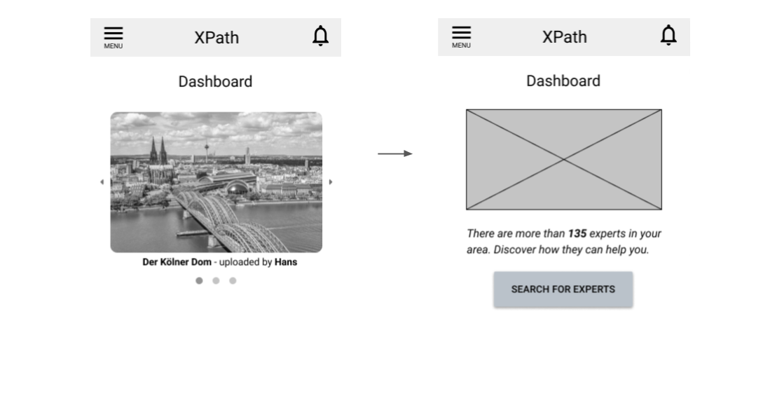
Issue #4 (medium severity): the image carousel is too overwhelming and there are no hints to the fact that this app is "for people and about people".
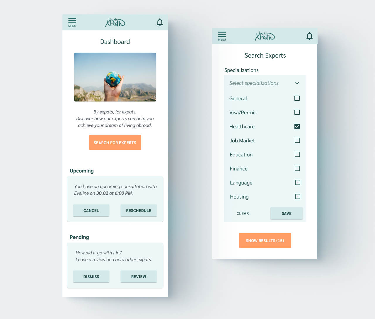
Possible Solution: added a CTA button and a short explanation about the number of available experts. Maintained a friendly image greeting users to their dashboard.
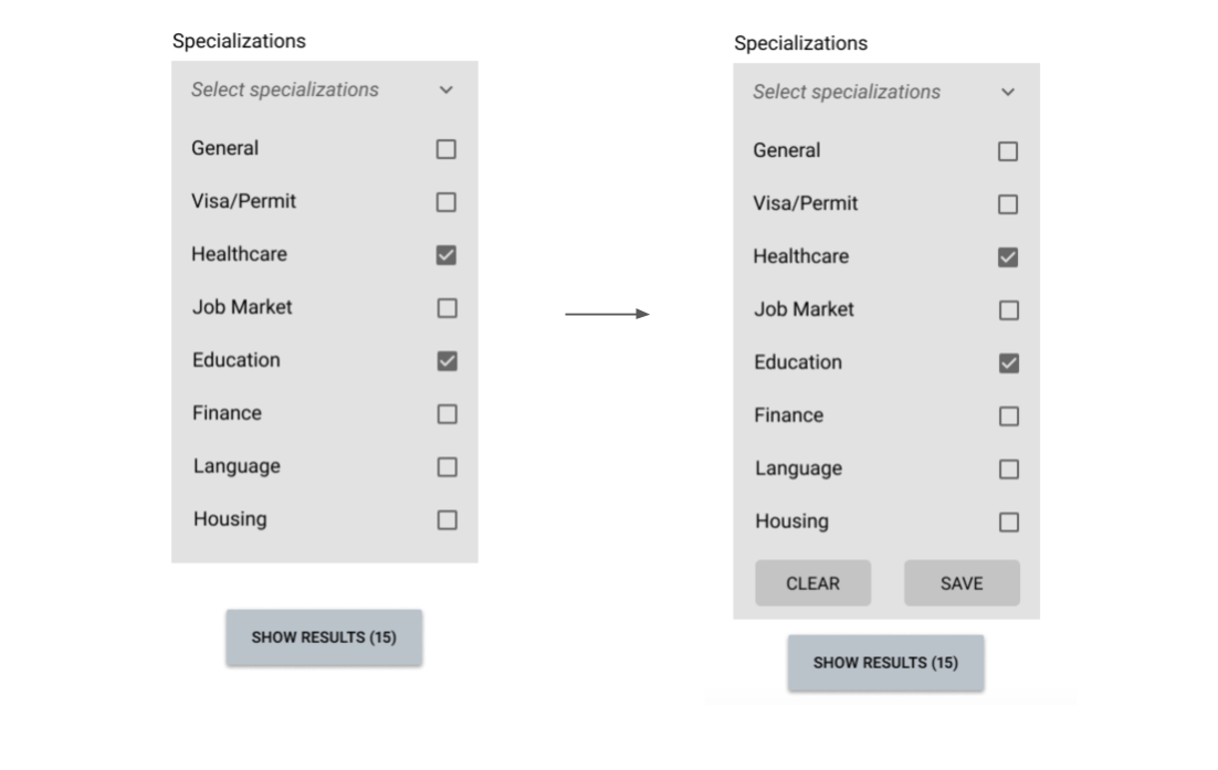
Issue #5 (high severity): every participant got stuck in closing the specialization dropdown menu.
Possible Solution: while it is indeed an issue that's specific to the prototype and most likely won't occur on the finished product, after a research I found out that it's not uncommon to add CLEAR and SAVE button on dropdown menus.
VISUAL DESIGN
Finally, I was ready to bring XPath to the next level and bring color to the interface. My choice for the colors were two pastel shades of green and light orange. XPath's voice is reassuring and calm, hopeful and encouraging. As users might not be native English speakers, simple vocabulary is preferable. Vivid colors, as well as colors that may be perceived as aggressive or anxiety-inducing should be avoided. Such guidelines were added to the style guide that will serve as a point of reference for future iterations and additions.
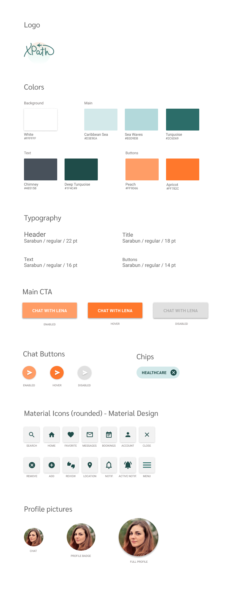
Following a peer review, I further polished the UI and worked on improving its accessibility. I revised the font size for readability purposes and checked the contrast of the color combinations in accordance to the Web Content Accessibility Guidelines (WCAG) 2.0.
KEY TAKEAWAYS
- Asking the right questions is crucial in the interview process. A carefully crafted question can give access to priceless information.
- Focus on the MVP. Adding a wide variety of features is tempting, but it's important to tell apart the core ones from the others.
- Stay true to the results of your research: you are not designing for your own taste, you are designing for people.
Ideally, the next phase would see the addition of the log-in and onboarding sections and the development of the application from the expert side, following a round of testing especially arranged for users offering the consulting service. If you are interested in the interactive prototype, you can take a look below.