Beese
Languages are often crucial for our careers, yet most of us fail in finding the time and lack the right tools. Based on SRS (Spaced Repetition System) and featuring the option to add field-specific word decks, Beese is an application aimed at empowering people to learn vocabulary in just a few minutes a day.
This project was developed in the context of my UX fundamentals course and was intended to make me familiarize with the concept of design thinking, applied to a real-world scenario.
Overview
- Role: UX Designer
- Tools: Pen & Paper, Sketch, Prott
- Time: 2 months
Learning new words and retaining vocabulary is no easy task, and it is especially difficult for busy people who can typically devote only a few minutes a day to study.
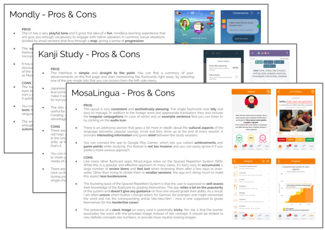
As a first step I evaluated three existing applications for learning vocabulary based on flashcard study. It gave me a better idea of what my competitors who focus on the same field are doing, in what they are succeeding and what could be improved, posing an opportunity for Beese.
“Sometimes it's just for the sake of it, for the experience of learning in itself. Mostly, though, I want to keep up with the languages I already speak, so I won't forget the words I already know and brush up my skills. ”
— Danilo, language student
USER INTERVIEWS
I conducted three interviews with people whose ages ranged from 30 to 55+, active in the workforce, who are somewhat familiar with vocabulary applications. The time they spend on average on learning new vocabulary, the main reasons they do so, their methods and motivations were the main focus of my interview questions. Their actions, thoughts and feeling resulting from the interviews were grouped so that I could have a clear idea of their needs.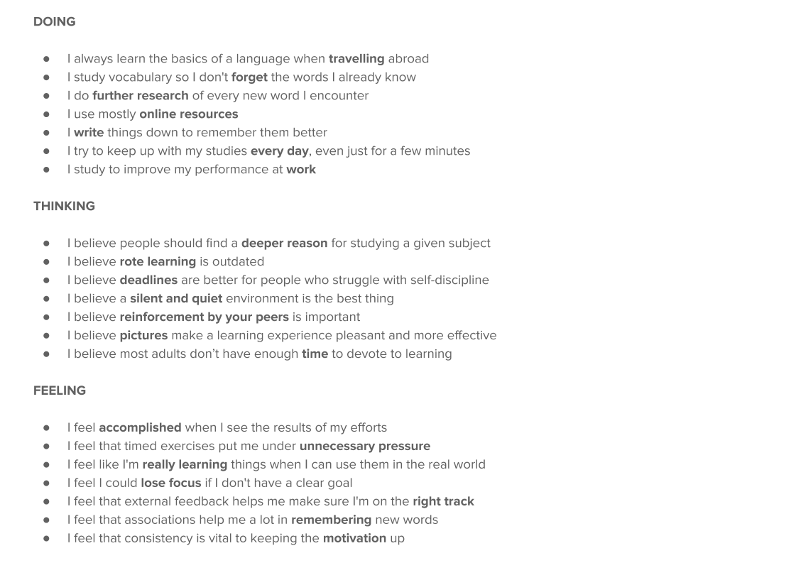
USER PERSONA
Adrienne is our primary persona for the Beese project. Her role is to help us to step into her shoes, empathize with her situation so that what we build shall keep in mind the needs of people who will be interacting with the product.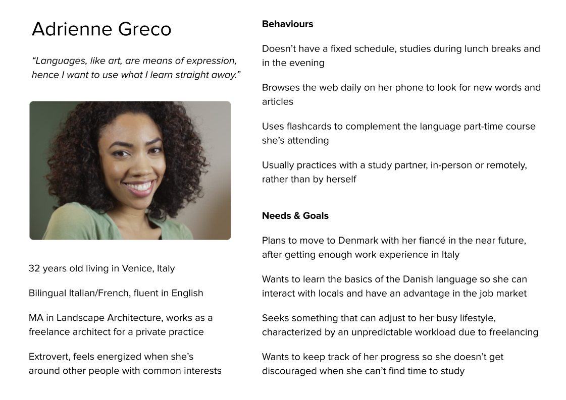
USER FLOWS
Thinking of what Adrienne would want to find on the application and which actions she will most likely carry out, I started creating a user flow of the main features. However, it was difficult to visualize every single step of the flows at this stage, and I felt like I needed to have even just a vague idea of how the application would look like. I therefore started sketching the screen at the same time I built the task flows. Pen and paper helped me get unstuck and have a clearer idea of the flows.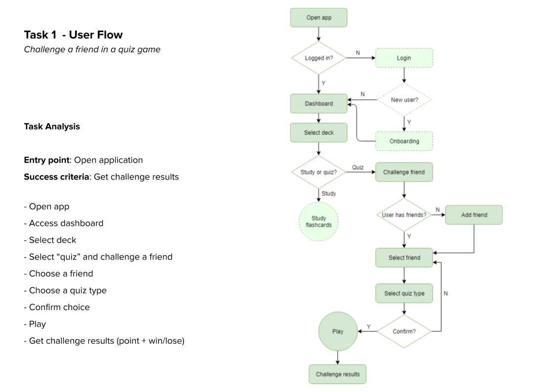
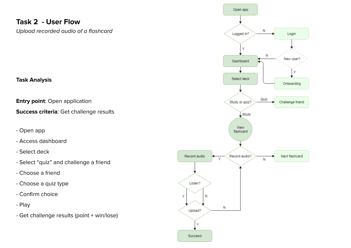
WIREFRAMING & PROTOTYPING
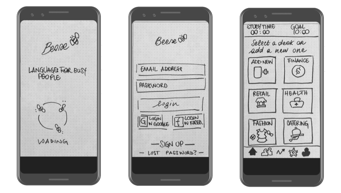
Starting from the sketches which helped me visualize better the user flows, I proceeded to sketch the rest of the screens of the application, focusing on the main features the app will be offering. The screens were later loaded on Prott to generate a clickable, low-fidelity prototype that would allow future users to test the application even from this early stages, providing the chance to implement quicker iterations.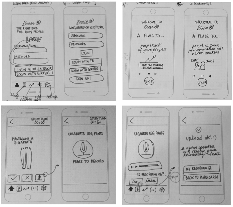
USABILITY TESTING
I conducted three usability testing session with 3 people - one in-person, two remote -, taking the Jakob Nielsen’s error severity rating scale as a reference to categorize their findings.
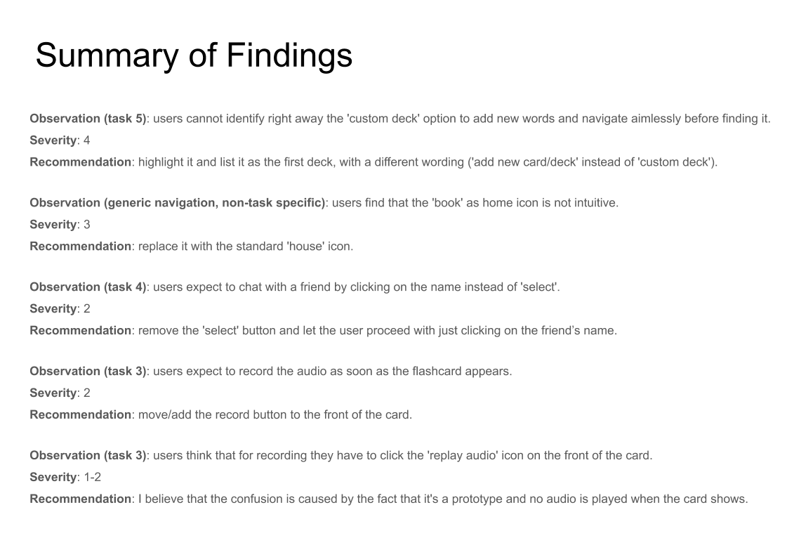
The low-fidelity prototype was iterated according to the feedback received during the usability testing. Below you can check it out.
In the next phase, the pen-and-paper prototype will be translated in a high-fidelity prototype and, from there, another session of usability testing will follow to see whether the implemented solutions solved the issues arose in the first session.
“It's easy to lose track of your learning goals if you don't have enough time to devote to them. I try by doing a little, even just a few minutes, every day. Consistency is important. ”
— Carol, interview participant