GreenHomes
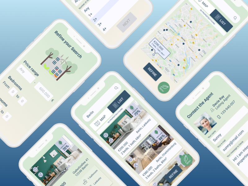
GreenHomes is a responsive web app for real estate buyers who wish to invest in properties assessed according to their sustainability potential.
The project was developed during my UI specialization at CareerFoundry, aimed at sharpening my UI skills.
Overview
- Role: UI Designer
- Tools: Pen & Paper, Sketch, Principle, InVision
- Time: 2 months
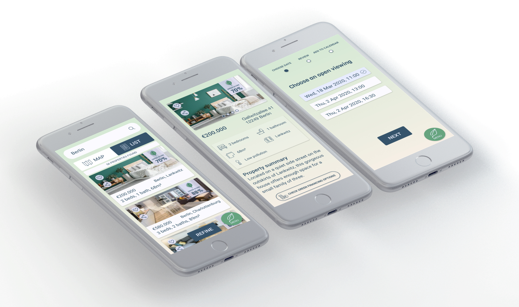
How can we reduce our carbon footprint, starting from the very place we call home? Real estate investment is a popular way for people to achieve financial security, but for those who also want to make an environmentally conscious decision it is often complicated to understand all the factors that come into play. While there are many resources out there providing information on real estate on sale, GreenHomes goes the extra mile, offering buyers a way to seal a future-proof investment by providing them with the details and existing opportunities needed to make their decision… greener!
For this project I was presented the following feature requirements:
- Sign in, create user profile, and input property criteria
- Search and filter available properties
- Access comprehensive information about a given property and its financing options
- Bookmark a property listing
- Property recommendations feature
- Ability to contact a real estate professional when wanting to move forward with a property

For the sign in feature I wanted to have a modal from which the user could easily input their data or sign up for a new account without necessarily having to go back to the home page. The information provided during the signup process is used to populate the feed page: since in this stage the user is not yet familiar with the green score, such feature is explained in the context of further filtering out the results.
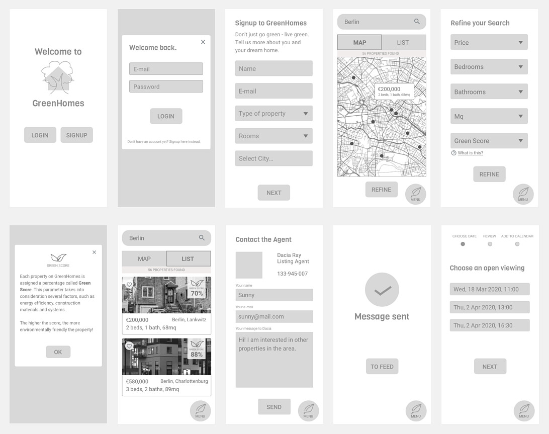
MOODBOARDS
After the mid-fidelity wireframes, I created two moodboards to visualize the visual direction of GreenHomes, inspired by the style guidelines:- Clean, quick, smart
- Greens or blues
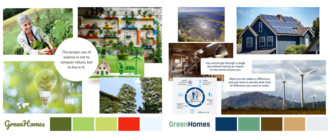
I ran a preference test on the two solutions. Those who favored the green moodboard said that - given the strong presence of a vivid green - it felt the most intuitive choice and that the blue one was too stark, whereas those who preferred the blue one felt that the other was too frilly and rated their favorite as more smart and professional.
These considerations led me to proceed with the blue moodboard: buying a house is a significant investment, and a more professional feeling would aid people to feel like they are in the hands of a trustworthy, responsible service.
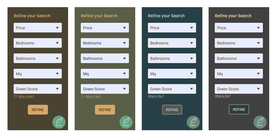
However it was also true that, when applying the palette, the first results looked somewhat too dense and old-fashioned.
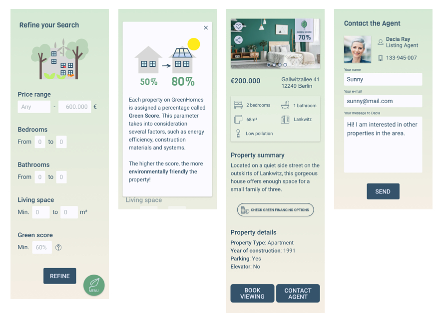
In order to make it smarter, clean and easy on the eye, I opted for pastel shades on a gradient background, maintaining the colors of nature along with the dark blue of the buttons.
ANIMATION
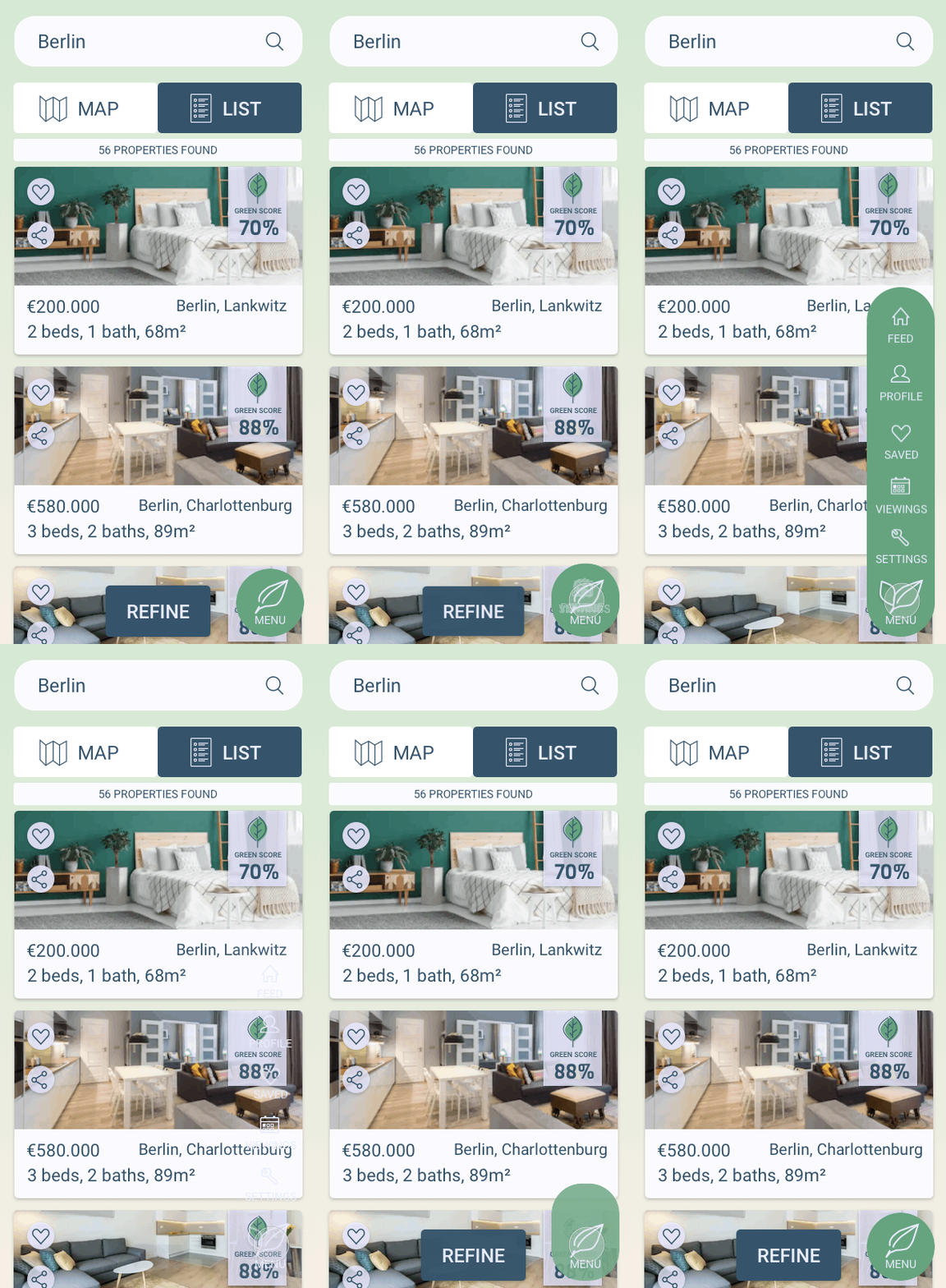
Since the menu cannot be properly shown in the wireframes, I decided to do so by animating it on Principle.
VISUAL STYLE GUIDE
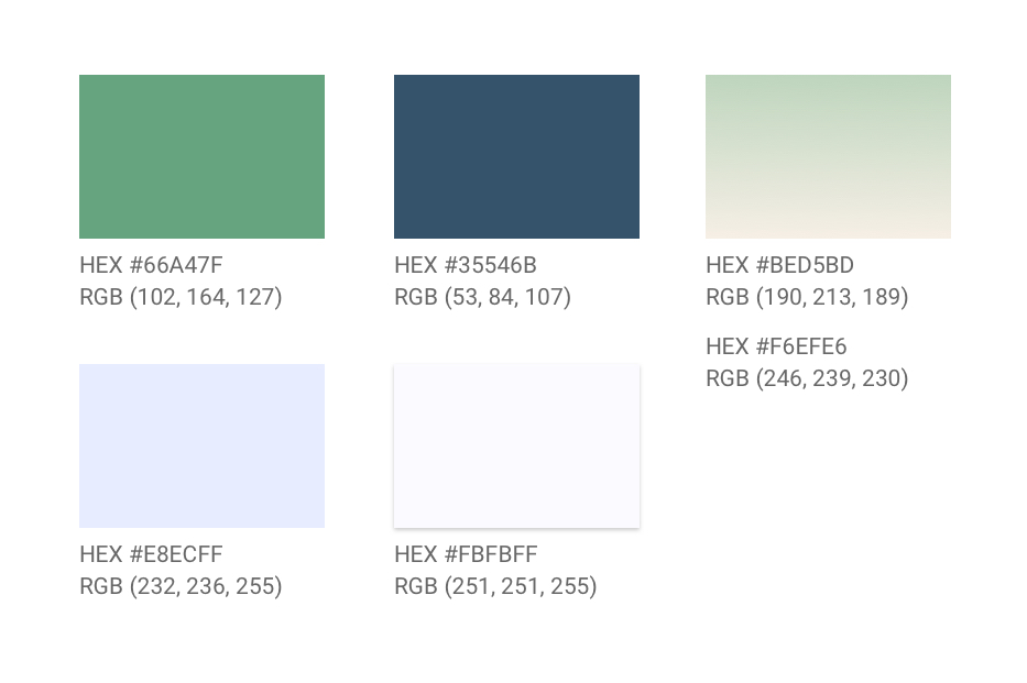
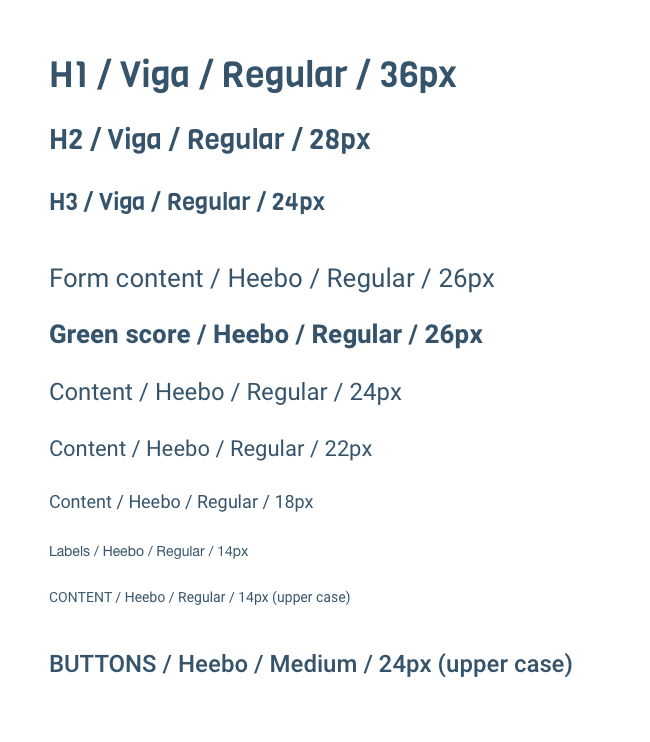
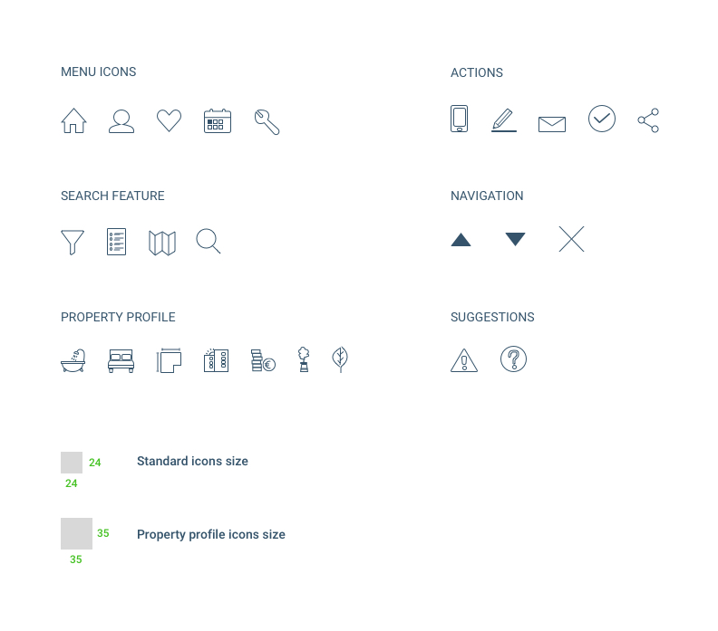
Below is a snapshot of the design guidelines for GreenHomes. To access the full visual style guide, click here.
COLOR PALETTE
TYPOGRAPHY
ICONS
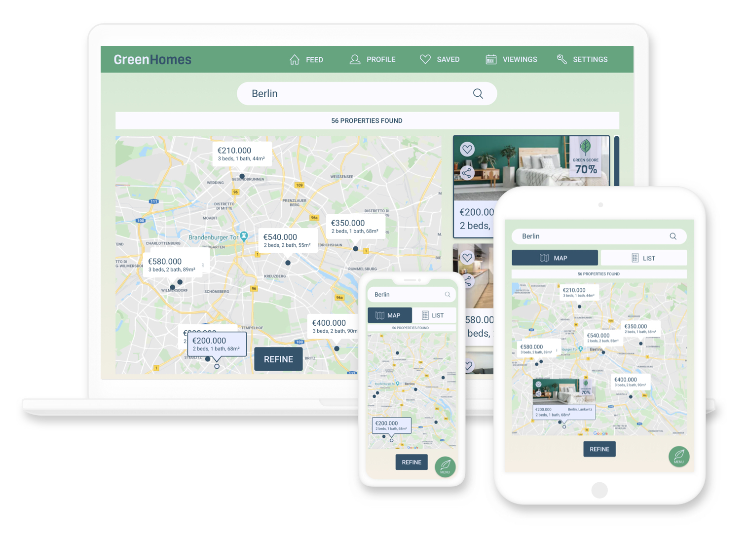
To visualize the interaction between screens, I created the prototype on InVision.
Here is how it looks on different screens.
KEY TAKEAWAYS
- Choosing between different solutions is not always easy. When in doubt, favor the one that best represents the project brief.
- Preference tests are a great way to bring in a fresh pair of eyes and validate or discard previous assumptions.
- Don't stress on the details too soon. The first sketches are going to look rough, accept that it's part of the process.